For the print and digital magazine, I act as a College of Fine Arts project manager, copy editor, and stakeholder. For the digital CFA 03 Magazine, I am solely responsible for web design and copy editing. In this project, I use some graphical elements designed and made available by Carnegie Mellon University (CMU) Marketing & Communications design team and by the freelance illustrator John Jay Cabuay. I use the University's Content Management System (CMS) as the framework for my layout, and I add some custom code for styling.
Many people are involved in creating the CFA 03 Magazine (print & digital), including CFA Assistant Dean for Communications Pamela Wigley, CFA Dean Dan Martin, the CFA Communicators, CFA Alumni Relations, the M&C Design team, freelance illustrator John Jay Cabuay, and freelance editor April Johnston.
Homepage
Hero Image
The first thing you see when you get to the homepage is a detail from the late Lowry Burgess's The Sunflower, which is the artwork also used for the print magazine's cover art. By using the same artwork, although I crop it differently, readers may understand that the digital and printed magazines share a version and a theme.
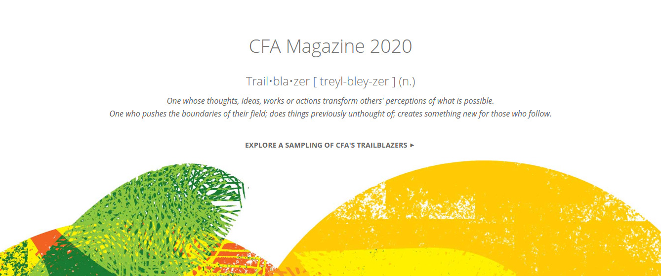
Trailblazer Showcase
Next you notice a call out for the Trailblazer showcase stories. Since trailblazer can be vague, I include the term and definition as I described it for the CFA Communicators who identified trailblazers and wrote their stories. Below the definition, a link leads to a pathfinding page with an introduction and link to each trailblazer biography.
For the graphic, I use a detail from John Jay Cabuay's trailblazer portrait illustrations to frame the section. Because of Cabuay's style and the graphic's rounded shape, the section feels more organic and human.
Letter from Dean Dan Martin
Each magazine issue, Dean Dan Martin writes a letter to magazine readers, styled similarly to a letter from the editor. I include this section near the beginning, where it appears in the print magazine.
Feature Section 1
Feature articles appear in rows of three with photographs and titles, and link to feature stories.
COVID-19 Story Call Out
This special call out is a welcome break between rows of feature stories. I include the same language as it appears in the print magazine, Answering the Call. I also include the icon CMU uses in its official COVID-19 communications so that people can effortlessly understand the section's content. This links to the Answering the Call page, which then links to stories written about COVID-19 throughout the year.
Feature Section 2
Feature articles appear in rows of three with photographs and titles, and link to feature stories.
Magazine Archive
This section provides those interested with an easy way to download a PDF of the printed version. They may also access an archive for past print and digital magazines.
Credits
I style the credit section simply so that it does not distract, but is available for those who are interested.
Footer
This is the footer as it appears across the CFA site. I include a vector image of the magazine logo that links to the homepage from any page within the CFA site.
Design Process
Comparative Benchmarking & Wireframes
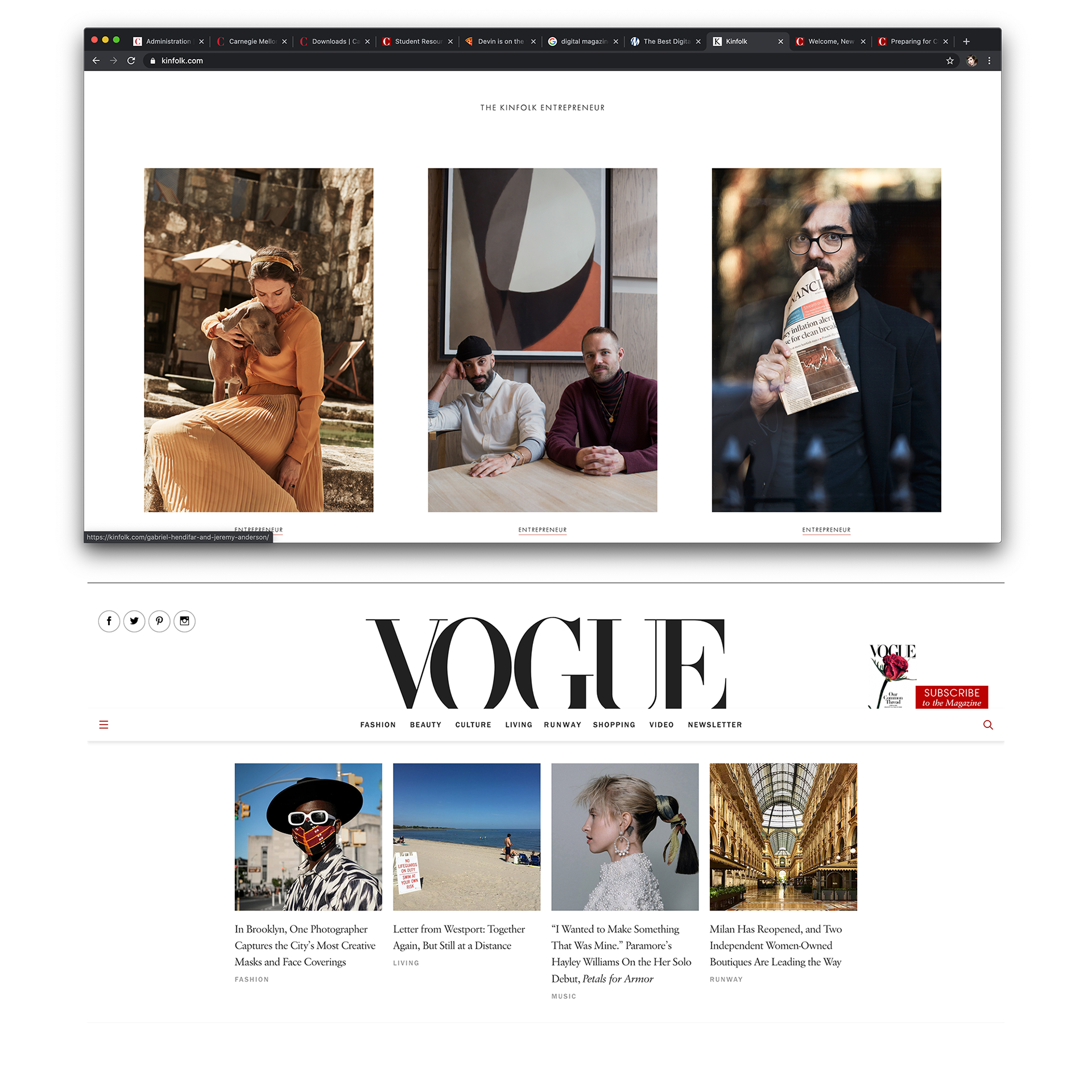
To start, I look for inspiration in a few places: the magazine's print design, other digital CMU magazines, digital arts publications, and websites for national and international magazines. I create a mood board from design patterns that I find striking.
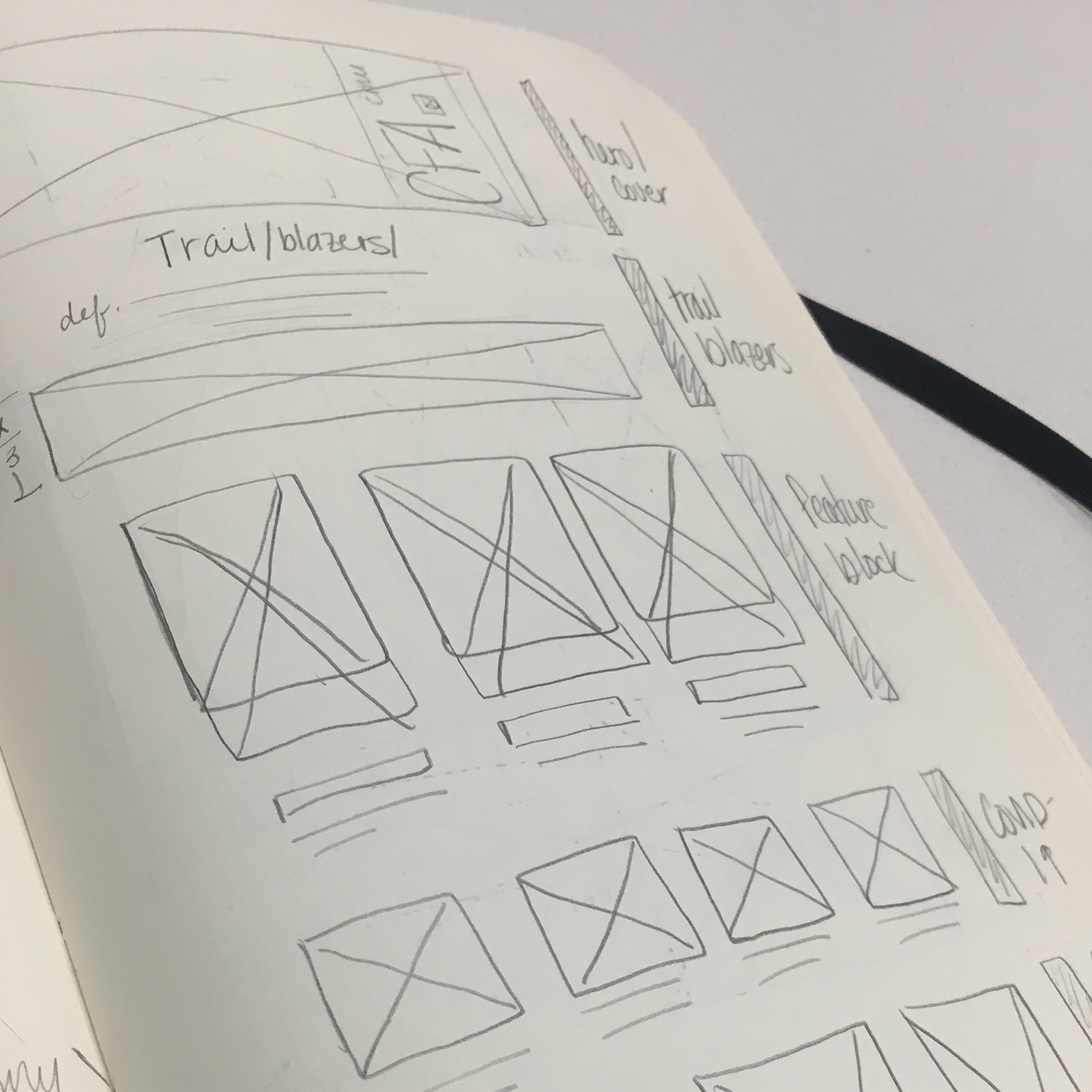
Once I find a few patterns I like, I draw wireframes by hand until I feel I have exhausted all the layout ideas I have that would work within CMS limitations.
Next I create the pages within the CMS, altering the layouts as I go.
Custom Styling
The CMS's styling can be limiting at times, especially when designing for editorial content. To change the style, I add custom CSS (which is only available for certain content types).
Heading 3 Tags
The CMS's third level headings are notoriously heavy and can draw a reader's eye more strongly than the second level headings. To correct this, I lighten the weight and color and increase the font size by 20% or 0.2em.


Blockquotes
The CMS blockquotes are too large and do not have an option for attributing quotes. I style them smaller to allow for longer quotes that do not overpower the body copy of articles. The CMS does not offer a way to attribute quotes, so I style the following text so that it is cohesive with the blockquote and does not compete with it.


Body Copy
The CMS does not offer a way to present body copy that feels editorial. The current options allow body copy to occupy the two leftmost columns in a three column grid, reserving the last third for sidebars; or the body copy can stretch all three columns with extremely long line lengths, which make it difficult for readers' eyes to track to the next line.
Correcting this is tricky, and has been attempted and failed by other experienced CMS "hackers" on my team (Marketing & Communications Digital Strategy team not my College of Fine Arts colleagues). The correction was surprisingly simple: wrap the content in a <div> that limits the line length, removes the existing margins, and uses the margins to center the text (allowing the text to be aligned as desired).


Imagery
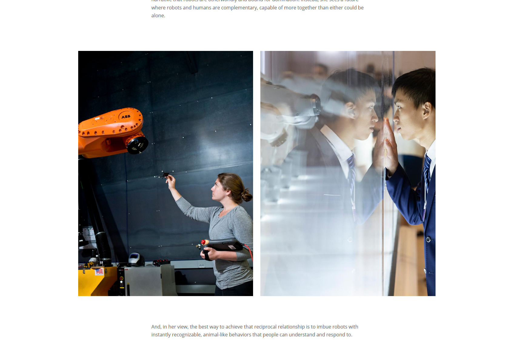
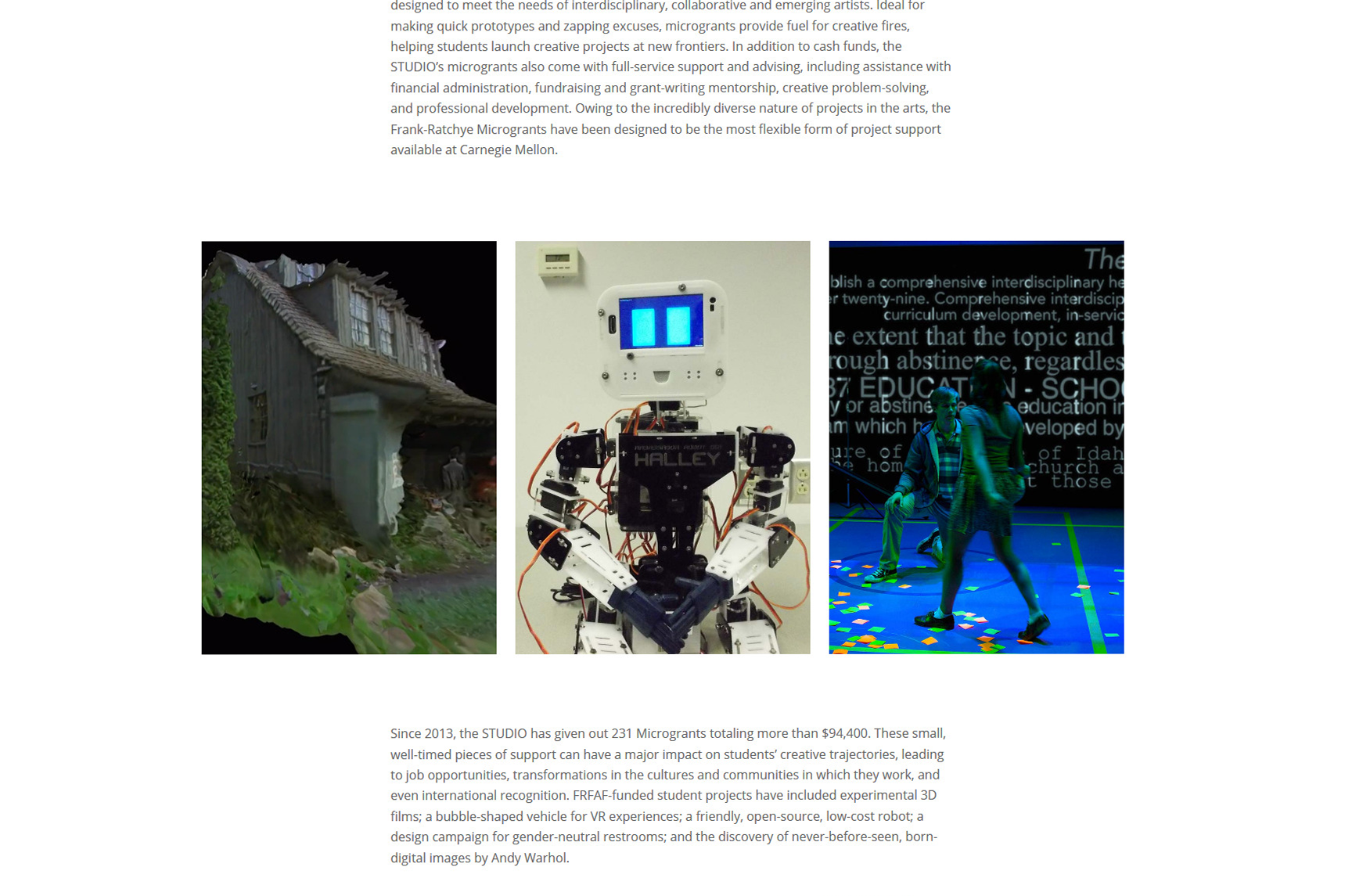
While performing comparative benchmarking, I found that most editorial layouts use rows of photography and images that are either square or landscape style. I encountered one site, Kinfolk, that used portrait style imagery, in rows of two or three. I thought this was striking and a good way to make the site feel more editorial since they are reminiscent of triptychs or diptychs.
Trailblazer Section
Using Illustrative Elements as Teasers
I use elements from Cabuay's illustrations as a way to provide hints about his style without giving away too much visual information. By doing this, I (1) create cohesion and coherence, providing an intuitive flow between pages and allowing the section to maintain the same style; (2) lend the pages a human, organic design and keep them from feeling too "boxy;" and (3) save the "wow" factor for the trailblazer biographies.
The first illustrative elements observant viewers may notice are the close up details taken from the portraits and rotated to frame the content in interesting ways. The next element they see is the series of closely cropped circular portraits. I format these so that the impression of the full portrait is saved for the individual trailblazer biography pages.


Trailblazer Biography Pages
The illustrations for the Trailblazer biography pages are absolutely stunning. I place them at the top of the page so that viewers notice them immediately. The custom styling that I do throughout the magazine (centered body copy with limited line length) compliments the portraits and allows readers to focus on Cabuay's gorgeous illustrations and the trailblazers' accomplishments.